
Five questions for scaremongers

Let’s be real. No-one knows what the economic effect of Brexit will be. Anyone who says they do is either kidding themselves or trying to kid you. But we do owe it to ourselves to make intelligent estimates and to set out our assumptions for scrutiny. So here goes. To start with, we break down the UK economy into sectors, using government definitions. No controversy there. Next, we make a couple of estimates.
First, an estimate of the shock for each sector of leaving the EU. This is a big part of what no one knows. This leads us to capture the vulnerability of each sector with the most punishing figures from the record: the collapse in output after the global financial meltdown of 2008 which was worse than any since WW2.
Second, an estimate of the recovery for each sector after five years. Once again we start with the post 2008 recovery after the financial meltdown. This provides a sense of the inherent resilience of each sector. And here is a good place to argue with us: we also include a small factor to reflect the policy response of government and the benefits which experts in international trade have observed from less restrictive trading arrangements. In fact we take only half of the benefit the experts have observed, erring on the side of caution.
Goods
The pie chart shows that the UK’s output of goods is made up of five more-or-less similar-sized elements: the most important ones are finished manufactures, oil and food. Basic materials are not as much in international trade as once they were; and “other” consists of the small sectors of semi-manufactures together with spares & repairs. Our figures are for 2013, but little has changed since.
Chart 1. UK goods

Source: ONS (2013)
Charts two to five below show the position, sector-by-sector, starting with trend growth from over the ten years from 2002 to 2011, that is including the financial crisis. Our estimates for these sectors, together with our estimates for the goods sector as a whole, show an hit from Brexit after one year (save for food etc, whose complement of entrepreneurs make it particularly resilient), with all recovering by the end of five years.
Charts 2 to 5. Outlook for selected UK goods sectors after Brexit

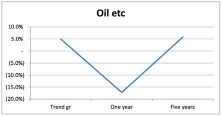


Sources: Authors, ONS (2013), Andriamendjara et al (2013), Berden et al (2007), Erixon and Bauer (2010), Helble et al (2007) and Petri, Plummer and Zhai (2011).
Services
Our pie chart for UK services is simplified by drawing like sectors together. We’ve followed Douglas McWilliams’ recent coinage, the “flat white economy”, bringing together professional services, culture/recreation, communications and technology services. Finance, insurance and real estate are self-explanatory. T&T is transportation and travel. The sectors not involved in international trade are utilities, distribution, healthcare, education and public administration.
Chart 6. UK services
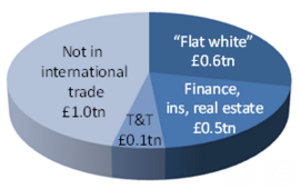
Source: ONS (2013)
Our estimates for the traded sectors - together with our estimates for the services sector as a whole - show smaller initial hits from Brexit (in the case of finance etc, none at all), with all making excellent progress after five years.
Charts 7 to 10. Outlook for selected UK services sectors after Brexit

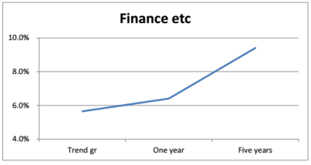

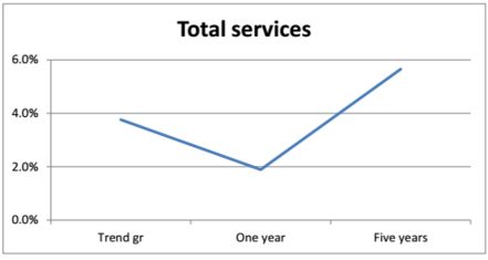
Sources: As charts 2 to 5.
Boris Johnson spoke of charts like these as “Nike ticks” and putting this all together we get the “Nike tick” for the economy as a whole.
Growth stays positive throughout, despite falling in the first year. The premium after five years should be seen as a spike on the benefits of deregulation and new markets.
Chart 11. Outlook for UK GDP after Brexit

Sources: As charts 2 to 5
Conclusion
Is it wrong to find these estimates encouraging? We make no apology for doing so, while fully admitting that ultimately all such estimates can only be a quantitative and graphical expression of assumptions. So are they dead right? Of course not. Are they a misleading basis for discussion? We don’t think so. Scaremongers who wish to dismiss them from consideration need to answer five questions:
- Why would the shock of Brexit be worse than the shock of the financial crisis?
- Why would UK firms be less resilient in bouncing back after Brexit than they have been since the 2008 turmoil?
- Take a look at our companion paper “Five questions for stayers”; why wouldn’t the UK and its trading partners benefit from relief from what the WTO shows as the world’s most complicated tariff regime, what the World Bank reports as a system of nontariff barriers second only to Russia, and priorities which put trade with the rest of the world at the back of the queue?
- Why would the UK government sit on its hands for five years after Brexit rather than develop new trading relations?
- Why would the benefit of those relations be less than the figures we are using, one half of the benefits from less restrictive trading environments attested by experts in the field?
To our way of thinking, our figures illustrate that the scare stories about Brexit are just that - scare stories. Do they prove it? No more and no less than the scare stories themselves!